Easier Said Than Done
To create an effective design, you must stick to some basic principles. I started searching these principles, analyzed some articles, and came across Usability Heuristics for User Interface design. These principles were highlighted by usability guru Jakob Nielsen. Why heuristics? Because these are rules of thumb and not strict and specific usability guidelines. This principle were formed in 1990, but they are still applicable today.
These principles are universal and they are simple and logical. Usability Heuristics can be used for websites, programs and mobile application. You can think that you can ignore them and nobody notice. It’s wrong because it is a key ingredient of the elegant design. Without these principles, your design won’t be interactive.
Jakob Nielsen’s principles bring a lot of benefits, including SEO. It is desirable that you check your resources for compliance with these principles.
Below are Ten Usability Heuristics:
1. Visibility of system status. User must understand what system does. System should always keep user informed about what is going on, through appropriate feedback within reasonable time.
Example: When you click to download some file, browser shows that download has started and its status.
2. Match between system and the real world. System must speak users’ language, without difficult technical terms. Follow real-world conventions making information appear in a natural and logical order.
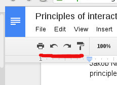
3. User control and freedom. Users always make mistakes and need to fix it to have some “emergency exit”, to go back as fast as possible.
Examples: In Google doc you have possibility go back to previous change.
4. Consistency and standards. Make sure that same words, same forms or actions mean the same thing. Don’t make users guess.
Examples: Google doc, sheet and slider have the same functionality in top left position in your windows.
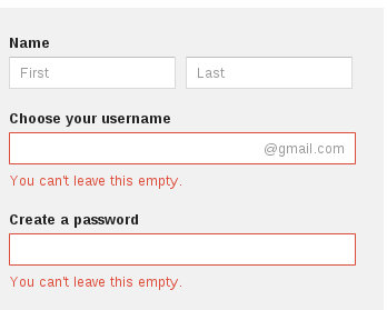
5. Error prevention. Effective design doesn’t only have good error messages but prevents users from making those errors.
Examples: When you want to create a Google account and miss some field, error message will remind what field is incorrect.
6. Recognition rather than recall. Minimize the user’s memory load by making objects, actions, and options visible.
Examples: Google has autocomplete feature in input field that helps you to find what you want.
7. Flexibility and efficiency of use. MAccelerators — unseen by the novice user — may often speed up the interaction for the expert user such that the system can cater to both inexperienced and experienced users. Allow users to tailor frequent actions.
8. Aesthetic and minimalist design. Dialogues should not contain information which is irrelevant or rarely needed.
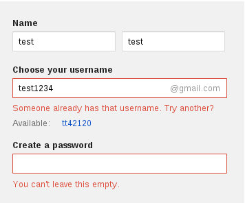
9. Help users recognize, diagnose, and recover from errors. Error messages should be expressed in user’s language, precisely indicating the problem.
Examples: When you want to create a Google account and have a problem, Google specifies the problem in error messages.
10. Help and documentation. Always make sure your system provides documentation to help the user.
Written by Romexsoft on March 27, 2015


