Published: April 11, 2023;
5 min read
| Updated: December 17, 2025
Explore the principles and best practices of responsive web design and mobile optimization in UI development. This comprehensive guide discusses how to create a UI that adapts to various devices and screen sizes, ensuring optimal user experience. Learn about the importance of responsive design, key principles for creating a flexible UI, and performance considerations for mobile optimization. Dive into the techniques for designing intuitive mobile interfaces, balancing aesthetics and functionality, and the tools available for responsive web design. This article is a must-read for anyone interested in enhancing user engagement and satisfaction through effective UI design.
Table of Contents
Table of Contents
Responsive web design is a modern approach to web development and front-end development that ensures your website looks and functions optimally on various devices, including desktops, laptops, tablets, and smartphones. This approach is a cornerstone of user interface (UI) design and a key factor in enhancing user experience (UX).
With the proliferation of different devices and screen sizes, responsive web design has become a necessity rather than a luxury. It’s about providing a seamless user experience, whether the user is accessing your website from a small smartphone or a large desktop monitor. It’s about ensuring that your website is not just visually appealing, but also functional and user-friendly on all devices.
With responsive web design, no matter what device a user is using, they will have a seamless and optimized browsing experience.

Mobile optimization is a crucial aspect of responsive web design. It involves designing and formatting your website so that it’s easy to read and navigate on a mobile device. In today’s digital landscape, where a significant portion of web traffic comes from mobile devices, mobile optimization is more important than ever.
Mobile optimization is not just about making a website mobile-friendly. It’s about understanding the mobile user’s needs and expectations and designing the website to meet those needs. It’s about ensuring that the mobile user’s experience is as good, if not better, than the experience of a desktop user.
With these principles, mobile optimisation becomes as easy as the ABC’s.
CSS media queries are a powerful tool for creating responsive layouts. They allow you to apply different styles depending on the characteristics of the device display, such as width, height, resolution, and orientation. By using media queries, you can ensure that your website’s layout adapts to provide the best possible viewing experience on any device.
Media queries are a key feature of CSS3 and are supported by all modern browsers. They allow you to specify different CSS rules for different device characteristics, giving you a high degree of control over how your website looks and behaves on different devices.
These are the main uses for CSS media queries.
Adapting images and other media for different devices is a crucial aspect of responsive web design. This involves ensuring that images are flexible and can resize to fit the screen, and using techniques like compression and lazy loading to optimize load times. Additionally, it’s important to consider how different media types, such as video and audio, will play on different devices.
Adapting images and media for different devices is not just about resizing them. It’s also about considering the capabilities and limitations of different devices. For example, a high-resolution image that looks good on a desktop might be too large to load quickly on a mobile device. Similarly, a video that plays automatically on a desktop might be annoying or disruptive on a mobile device.
UI, or User Interface, refers to the graphical layout of an application. It includes the buttons users click on, the text they read, the images, sliders, text entry fields, and all the rest of the items the user interacts with. For example, the UI of a website could include a navigation bar, buttons, text, images, sliders, form fields, and more.
Yes, UI is a part of web design but they are not the same. Web design is a broad term that encompasses a variety of tasks involved in creating a website, including graphic design, content development, and UI design. UI design specifically focuses on the visual experience of the user and how they interact with the website.
Yes, UI is a part of UX (User Experience) design. While UI focuses on the visual elements of a design that a user interacts with, UX design is concerned with the overall experience a user has with a product or service. UX involves a broader scope, including aspects like usability, functionality, and user interaction.
While there are overlaps, UI design and graphic design are different. Graphic design is a broader field that includes creating visuals that communicate a specific message. UI design, on the other hand, is focused specifically on the design of interactive interfaces for software and applications.
While it's not always necessary, understanding basic coding can be beneficial for a UI designer. It can help in creating more effective designs and communicating better with developers. However, many UI designers work with tools that don't require coding.
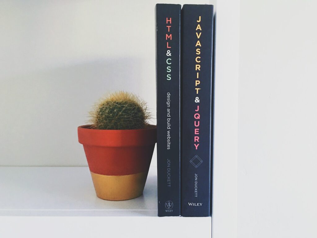
HTML (HyperText Markup Language) is a coding language used to structure content on the web. It's a tool used in the creation of UI, but it's not UI itself. Similarly, it contributes to the UX by structuring information in a way that's easy to navigate, but it's not UX itself.
CSS (Cascading Style Sheets) is a stylesheet language used for describing the look and formatting of a document written in HTML. It's used in UI development to style the visual elements of a website or application, including layout, colors, and fonts.
Yes, CSS is a crucial tool for UI design. It allows designers to create visually appealing websites by styling the HTML elements. With CSS, designers can control the layout of multiple web pages all at once and create variations in display for different devices.
JavaScript can be used to enhance the UI by making it more interactive. It can be used to create dynamic elements such as sliders, pop-up menus, form validations, and more. JavaScript libraries and frameworks, such as jQuery and React, provide pre-written JavaScript code to aid in building interactive features.
Python is a programming language that can be used to create GUI (Graphical User Interface) applications. Libraries like Tkinter, PyQt, and Kivy can be used with Python to create desktop applications with a graphical user interface.
The choice of language for GUI development often depends on the specific requirements of the project. However, some commonly used languages for GUI development include Java, C#, Python, and JavaScript.
The concept of the Graphical User Interface (GUI) was developed in the 1970s at the Xerox Palo Alto Research Center (PARC). However, it was Apple's Macintosh and Microsoft's Windows operating system that popularized GUIs in the 1980s and 1990s.